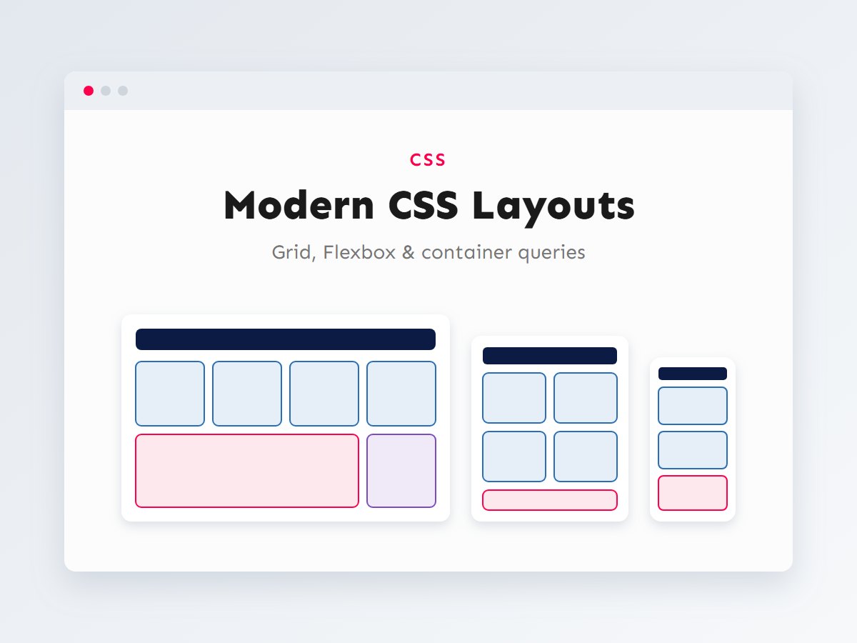

Responsive design used to mean a stylesheet full of media queries, floats, clearfix hacks and fixed breakpoints for “phone”, “tablet” and “desktop”. Every new screen size meant another tweak. Modern CSS works differently. With Flexbox, Grid, clamp() and container queries, layouts can adapt to the space they have, often with no media queries at all.
In this guide I’ll show the layout techniques I use on WordPress block themes and Shopify themes every day, when to choose Flexbox or Grid, and how to apply them inside theme.json and Shopify sections. Every example is plain CSS you can copy into a project today.
In this article
- Flexbox or Grid?
- A responsive card grid with no media queries
- Page layouts with grid-template-areas
- Fluid typography and spacing with clamp()
- Container queries: components that adapt to their space
- Logical properties and right-to-left languages
- In WordPress block themes
- In Shopify sections
- Common layout mistakes
Flexbox or Grid?
Both are layout systems, and they overlap, but they think differently. Flexbox is one-dimensional: it lays items out along a single line (a row or a column) and lets each item size itself from its content. Grid is two-dimensional: you define rows and columns, and items line up in both directions at once.
My rule of thumb: if you’re arranging items in a line and want them to size naturally (a header with a logo and a menu, a row of buttons, a tag list), use Flexbox. If you want things to line up in columns (product grids, blog cards, a page with a sidebar), use Grid. Most real layouts use both: Grid for the page, Flexbox inside the components.
/* Flexbox: a site header that wraps gracefully on small screens */
.site-header {
	display: flex;
	flex-wrap: wrap;
	align-items: center;
	justify-content: space-between;
	gap: 1rem 2rem; /* row gap, column gap */
}

.site-header nav ul {
	display: flex;
	flex-wrap: wrap;
	gap: 0.5rem 1.5rem;
	list-style: none;
	margin: 0;
	padding: 0;
}
Use gap instead of margins on children. It only adds space between items, so there are no stray margins at the edges to cancel out.
A responsive card grid with no media queries
This is the single most useful layout snippet I know. It creates as many columns as fit, each at least 16rem wide, and stretches them to fill the row. On a wide screen you get four columns, on a tablet two, on a phone one, with no breakpoints.
.card-grid {
	display: grid;
	grid-template-columns: repeat(auto-fit, minmax(min(16rem, 100%), 1fr));
	gap: clamp(1rem, 2vw, 2rem);
}auto-fitcreates as many columns as fit and collapses empty ones, so a row with two items stretches them. Useauto-fillif you want empty column slots kept so cards stay the same width.minmax(…, 1fr): each column is at least the minimum width and shares the leftover space equally.min(16rem, 100%)stops the card overflowing on screens narrower than 16rem, a subtle but important detail.
Page layouts with grid-template-areas
For whole-page layouts, grid-template-areas lets you draw the layout with names. It’s very readable and makes rearranging the layout per screen size trivial. Here a sidebar moves under the main content on small screens and beside it on large ones:
.page {
	display: grid;
	gap: 2rem;
	grid-template-columns: minmax(0, 1fr);
	grid-template-areas:
		"header"
		"main"
		"sidebar"
		"footer";
}

@media (min-width: 60rem) {
	.page {
		grid-template-columns: minmax(0, 1fr) 20rem;
		grid-template-areas:
			"header  header"
			"main    sidebar"
			"footer  footer";
	}
}

.page > header { grid-area: header; }
.page > main   { grid-area: main; }
.page > aside  { grid-area: sidebar; }
.page > footer { grid-area: footer; }
Note minmax(0, 1fr) instead of plain 1fr. A plain 1fr track won’t shrink below its content’s minimum size, so a long URL or a wide code block can push the whole layout off screen. minmax(0, 1fr) prevents that.
Fluid typography and spacing with clamp()
clamp(minimum, preferred, maximum) lets a value grow smoothly with the viewport between two limits. Instead of a heading that jumps from 32px to 56px at a breakpoint, it scales gradually and never goes below or above the limits you set:
:root {
	--space-section: clamp(3rem, 2rem + 4vw, 6rem);
}

h1 {
	/* 2rem on small phones, 3.5rem on large screens, smooth in between */
	font-size: clamp(2rem, 1.2rem + 3vw, 3.5rem);
	line-height: 1.15;
}

.section {
	padding-block: var(--space-section);
}
Mixing rem with vw in the middle value matters for accessibility: if the preferred value were pure vw, the text wouldn’t grow when a visitor zooms or increases their browser’s font size.
Container queries: components that adapt to their space
Media queries ask “how wide is the screen?” But a component doesn’t care about the screen; it cares about the space it was given. A product card in a wide content area and the same card in a narrow sidebar need different layouts on the same screen. Container queries solve exactly this, and they’re supported in all modern browsers.
/* 1. Mark the wrapper as a container */
.card-slot {
	container-type: inline-size;
	container-name: card;
}

/* 2. Default (narrow) layout: stacked */
.product-card {
	display: grid;
	gap: 0.75rem;
}

/* 3. When the CONTAINER is wide enough, go horizontal */
@container card (min-width: 28rem) {
	.product-card {
		grid-template-columns: 10rem minmax(0, 1fr);
		align-items: center;
		gap: 1.25rem;
	}
}

/* Container units scale with the container, not the viewport */
.product-card__title {
	font-size: clamp(1rem, 0.8rem + 2cqi, 1.4rem);
}
This is ideal for WordPress blocks and Shopify sections, which merchants and editors can drop into any column width. The component takes care of itself wherever it’s placed.
Logical properties and right-to-left languages
Properties like margin-left assume text flows left to right. Logical properties describe direction relative to the text instead: inline is the reading direction and block is the stacking direction. If a site ever adds a right-to-left language such as Urdu or Arabic, layouts written with logical properties flip correctly on their own.
.notice {
	padding-block: 1rem;                       /* top + bottom */
	padding-inline: 1.5rem;                    /* left + right (start + end) */
	border-inline-start: 4px solid #ff004d;    /* left in English, right in Urdu */
	margin-block-end: 1.5rem;                  /* bottom */
}

.thumbnail {
	inline-size: 100%;        /* width */
	aspect-ratio: 4 / 3;      /* reserve space: no layout shift */
	object-fit: cover;
}
aspect-ratio is worth calling out: reserving an image’s space before it loads prevents content from jumping, which helps your Cumulative Layout Shift score. More on that in my Core Web Vitals checklist.
| Need | Reach for |
|---|---|
| Items in a row that size to their content | Flexbox with gap and flex-wrap |
| Cards that line up in columns | Grid with auto-fit + minmax() |
| A page with header, sidebar and footer | Grid with grid-template-areas |
| Text and spacing that scale smoothly | clamp() |
| A component used in different column widths | Container queries |
| Layouts that work in RTL languages | Logical properties |
| Images that don’t shift the layout | aspect-ratio or width/height attributes |
In WordPress block themes
Block themes put many of these ideas into theme.json, so editors get responsive layouts without writing CSS. Content and wide widths control how blocks are constrained, and fluid font sizes generate clamp() values for you:
{
	"version": 3,
	"settings": {
		"layout": {
			"contentSize": "720px",
			"wideSize": "1200px"
		},
		"typography": {
			"fluid": true,
			"fontSizes": [
				{
					"slug": "x-large",
					"name": "Extra large",
					"size": "2.5rem",
					"fluid": { "min": "1.75rem", "max": "2.5rem" }
				}
			]
		}
	}
}
In the editor, the Group block’s Grid variation uses CSS Grid under the hood. With a minimum column width set, it behaves like the auto-fit grid above, so editors can build responsive card layouts by themselves. For components with their own logic, a custom block styled with container queries is a great fit; see building custom Gutenberg blocks with React.
In Shopify sections
Shopify sections can expose layout choices to merchants through settings, and CSS custom properties connect those settings to your CSS cleanly. Liquid’s {% style %} tag outputs CSS that the theme editor can update live while the merchant adjusts settings:
{%- style -%}
  #shopify-section-{{ section.id }} .collection-grid {
    display: grid;
    gap: clamp(1rem, 2vw, 1.75rem);
    grid-template-columns: repeat(2, minmax(0, 1fr));
  }
  @media screen and (min-width: 990px) {
    #shopify-section-{{ section.id }} .collection-grid {
      grid-template-columns: repeat({{ section.settings.columns }}, minmax(0, 1fr));
    }
  }
{%- endstyle -%}

<div class="collection-grid">
  {%- for product in section.settings.collection.products limit: 8 -%}
    {%- render 'product-card', product: product -%}
  {%- endfor -%}
</div>

{% schema %}
{
  "name": "Collection grid",
  "settings": [
    { "type": "collection", "id": "collection", "label": "Collection" },
    {
      "type": "range", "id": "columns", "label": "Columns on desktop",
      "min": 2, "max": 5, "step": 1, "default": 4
    }
  ],
  "presets": [{ "name": "Collection grid" }]
}
{% endschema %}
Scoping styles with #shopify-section-{{ section.id }} means two copies of the same section on one page can have different column counts without clashing. If you’re new to sections and schemas, start with my Shopify theme development guide.
Common layout mistakes
These are the problems I fix most often when reviewing theme CSS. Each one is small, but together they’re the difference between a layout that holds up and one that breaks on the first long product name.
- Fixed widths and heights. A card with
height: 320pxoverflows as soon as a title wraps onto three lines. Let content decide the height, and usemin-heightoraspect-ratiowhen you really need a minimum. - Breakpoints for devices. “iPhone width” and “iPad width” change every year. Add a breakpoint where your layout starts to look wrong, or avoid it entirely with auto-fit grids and container queries.
- Plain
1frtracks with wide content. Long URLs, tables or code blocks force the column wider than the screen. Useminmax(0, 1fr), and give wide content its ownoverflow-x: autowrapper. - Margins on every child. Spacing with
margin-bottomon items leaves a stray gap after the last one.gapon the parent spaces items evenly with nothing to undo. - Visual order that doesn’t match the source. Grid and Flexbox can reorder items visually with
orderor placement, but keyboard and screen-reader users still follow the HTML order. Reorder the HTML when the meaning changes; use CSS reordering only for purely visual tweaks. - Images without reserved space. An image with no width/height or
aspect-ratiopushes content down when it loads. That’s a layout shift, and visitors feel it as the page “jumping”.
A quick test catches most of these: resize the browser slowly from wide to narrow, then add a product or post with a very long title. If nothing overflows or overlaps on the way, the layout is in good shape.
Key takeaways
- Flexbox for items in a line; Grid for rows and columns. Most layouts use both.
repeat(auto-fit, minmax(min(16rem, 100%), 1fr))gives a responsive grid with no media queries.- Use
minmax(0, 1fr)to stop long content from breaking grid layouts. clamp()scales type and spacing smoothly; mixremandvwso zoom still works.- Container queries make blocks and sections adapt to any column they’re placed in.
Clean, modern CSS makes a theme lighter, easier to maintain and far more flexible for the people editing it. If you need a WordPress or Shopify theme built or refactored with layouts that work on every screen, get in touch or see the services I offer.